
A software developer from Canada has collected data from the Flappy Bird spinoff, the massively successful multiplayer online game Flapmmo.com
 Photograph: Connor Sauve
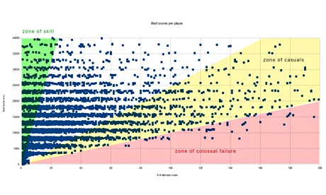
This graph is certainly one of the more interesting created by Sauve and compares the number of attempts made during the four-hour period (x axis) against how well they did (y axis).
 Photograph: Connor Sauve
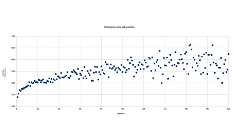 Photograph: Connor Sauve
Accenture: Flappy Bird creator removes game from app stores - 10 Feb 2014 Photograph: REX
Two weeks ago, the world thought it was at peak Flappy Bird. But oncethe developer pulled it from the Apple and Google app stores, a swathe of versions appeared online, none more notable than flapmmo.com, which allows users to compete against each other in (almost) real-time.
Since the online game launched two weeks ago, the game has not only seen a surge in popularity but has also undergone a number of iterations. Besides adding extra servers, the developers have heightened the graphics by making the user interface more aesthetically pleasing as well as adding statistics to the gameplay.
This means users can not only see where fellow gamers are failing (ie they can see where each bird hits an obstacle) but statistics have been introduced underneath each pipe, to show the percentage of "deaths" at each pipe (the stats are reset every two hours). Now, the developers arelooking to launch a mobile app, according to their Twitter account.
But after the developers updated the game, one Canadian software developer, Connor Sauve, a former student at the University of Victoria in British Columbia, realised the game was now tracking the number of flaps made by each user. Previously, the bird's x and y co-ordinates were sent back to servers every 50ms.
For gamers, this means they now see "recordings" of previous attempts by other users rather than the exact movements of those playing at the same time.
With that in mind, Sauve left the game open and a local server logged the various attempts made by other users. He ended up logging an incredible 419,000 game attempts, giving him a wealth of data to analyse.
Here are three of the most interesting trends from the data:
1. Some people are just really addicted
Photograph: Connor SauveThis graph is certainly one of the more interesting created by Sauve and compares the number of attempts made during the four-hour period (x axis) against how well they did (y axis).
One of the most intriguing points is that one person made nearly 200 attempts and could only stay "alive" for 15 seconds, leaving this gamer to fall into the "zone of colossal failure" (in pink), so dubbed by Sauve for those who ended with fairly dreadful scores when compared with the amount of effort they spent playing the game.
While the game might be hard, some might consider it a little odd to not substantially improve after so much practice.
It's interesting to note the variation in players too – players who are good at the game ended their gaming sessions fairly early (in the green "zone of skill") whereas those who weren't so good kept trying to beat their previous high scores.
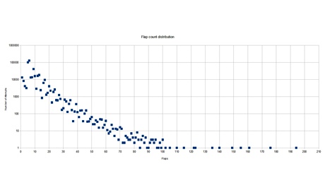
2. The further you get, the more difficult it becomes
Photograph: Connor Sauve
This graph looks at how successful gamers were, by comparing the number of attempts (y axis) with the number of "flaps" (x axis), which almost always equates to someone getting further in the game.
A downward trend is clearly visible through the points, at least up to 100 flaps. After 100 flaps, only 14 people managed to survive, leading to the conclusion that less than two people in every 100,000 can get into treble figures in terms of flaps.
This is perhaps a surprise as the game doesn't necessarily get more difficult. Users are faced with the same challenge at every point in the game – get through the pipe – with some suggesting the game gets slightly faster as you go further.
It would be more helpful to have more information at this point. For example, were those who got particularly far the same users how only took a few attempts and why did people fail – was it a lapse of concentration or just boredom?
3. But don't lose hope, people get better with practice
Photograph: Connor Sauve
Sauve wanted to understand if there was a learning curve in the game, that's to say he wanted to know if people got better if they just kept playing.
To create this chart, Sauve only included gamers who had decided to play with nicknames and ignored unnamed participants. It shows the score achieved (y axis) and the number of attempts (x axis). It appears that those who appeared into the green "zone of skill" in the first chart (ie those who performed remarkably in very few attempts) chose not to bother with nicknames as otherwise there would be many more points appearing towards the top-left.
No comments:
Post a Comment